


How to Create a Component in Blazor


Last Update: Jun 7, 2024

AI changed software development. This is how the pros use it.
Written for working developers, Coding with AI goes beyond hype to show how AI fits into real production workflows. Learn how to integrate AI into Python projects, avoid hallucinations, refactor safely, generate tests and docs, and reclaim hours of development time—using techniques tested in real-world projects.
Today we’re going to dig into Blazor components. They’re easy to use and extremely powerful. I love the way they work, and after this tutorial, you may love them too.
If you would rather watch a video of this tutorial, you can watch it here.
After completing this tutorial, you will be able to:
- Identify the parts of a Blazor component
- Create a new Blazor component
- Embed a component within another component
So let’s dig in.
What are Blazor Components and Why Should I Care?
Blazor components are reusable chunks of code that combine markup and data. They’re used to create interactive interfaces in web applications. They use Razor Syntax to connect data with code. They’re also sometimes called Razor components.
For decades, display elements have been HTML, CSS, and JavaScript. This forms what the user sees in a web browser or mobile application. Razor uses all of these as well but adds in data. It can be added to the code dynamically. Razor components contain HTML and C#.
The advantage of using Blazor components is good design. You can create small, self-contained components that can be reused throughout the application (or in other applications). They can be extended or embedded to make a clean, cohesive design. They can create database-driven components that are fully interactive.
When you get the hang of using Blazor Components, you’ll enjoy the simplicity and power they bring. Let’s dig in.
Creating a New Blazor Server App
If you’re following along, create a new Blazor Server app in Visual Studio. I’m using Visual Studio 2022.
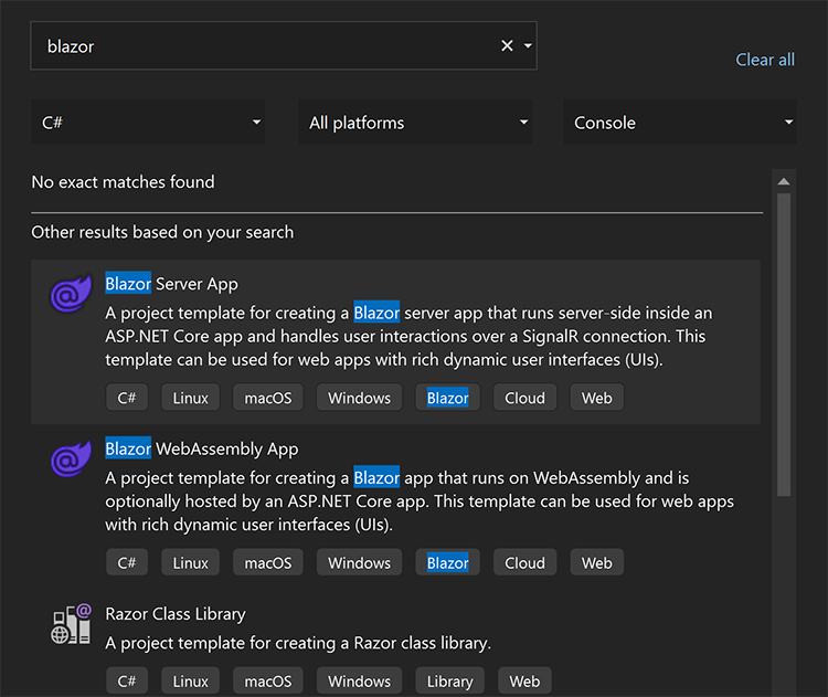
Search for “Blazor” in templates, and select a Blazor Server App.
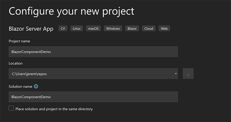
We will name our project BlazorComponentDemo
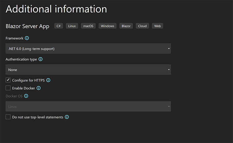
And we’ll use .NET 6 support (or .NET 7 if you like).
This will be the project we’re working on in this tutorial.
Examining the Counter Component
In our project file, let’s open our counter component. We’ll examine the code and how it’s set up.
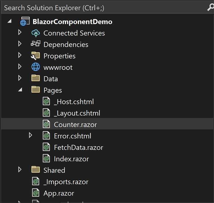
Counter.razor is a default component created when you build a new Blazor Server/WebAssembly app. This is called scaffolding. Visual Studio assembles a Blazor application with some pre built components to show you how they work.
Here is the code from Counter.razor:
@page "/counter"

<PageTitle>Counter</PageTitle>

<h1>Counter</h1>

<p role="status">Current count: @currentCount</p>

<button class="btn btn-primary" @onclick="IncrementCount">Click me</button>

@code {
    private int currentCount = 0;

    private void IncrementCount()
    {
        currentCount++;
    }
}
This code is simple, but let’s break it down.
A component contains three parts:
- Component parameters
- HTML Markup
- C# Code
Let’s look at the first component parameter, the page directive.
The Page Directive
At the top of the file, we have a page directive. The @page directive defines a Blazor component representing a standalone page in a web application. It means the entire component is a page in your application. A URL is included that defines where that page lives.
@page "/counter"
Since we have this, we know this component is its own page, and it lives at /counter. So if we type in oururl.com/counter we’ll find it. Components do not have to be standalone pages. They can also be partial snippets to insert into a page, which we will demonstrate.
Next, we have a PageTitle declaration. This is used to modify the <head> info of the page.
<PageTitle>Counter</PageTitle>
This tag specifies we want the title of the page to be “Counter”
The Markup Area
This is the 2nd part of a component, the HTML Markup. The markup area is where you see HTML that is displayed to the visitor of your web app. These are visual components the user sees.
<h1>Counter</h1>

<p role="status">Current count: @currentCount</p>

<button class="btn btn-primary" @onclick="IncrementCount">Click me</button>
The first line is a basic h1 tag. Pretty standard.
<p role="status">Current count: @currentCount</p>
Next, we have a p tag, and you may notice the @currentCount property. This is a dynamic variable that references a property in our C# code. It keeps track of the count of clicks the user has made.
<button class="btn btn-primary" @onclick="IncrementCount">Click me</button>
The button tag also has an attribute named onclick. This is a reference to what should happen when the user clicks the button. In our case, it will call IncrementCount when the user clicks the button. This will be a method in our code.
Let’s take a look at our code.
The Code Area
This is the third and final part of a component. The code area is where you write C# code to interact with the components in the markup area. It contains C# code.
@code {
    private int currentCount = 0;

    private void IncrementCount()
    {
        currentCount++;
    }
}
Here we can see a property of our code currentCount. This is an integer set to zero. The property @currentCount in our markup is bound to it. Meaning whatever this value is, it shows up on the page, even when it changes.
private int currentCount = 0;
The next part is the IncrementCount method. This method is called when the user clicks the button. It increments the current count and returns void (nothing).
private void IncrementCount()
{
  currentCount++;
}
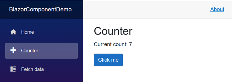
This is the code area of the component, and when you run the application, it all comes together and shows you an interactive button that increments a number every time you click it.
Awesome! Let’s make our own.
Creating a New Component
We will create a new component that generates a random number when you click a button.
We can make this component on a full page like the counter component or a component within another component. Let’s do that. We’ll make this a freestanding component, and insert it into the counter page.
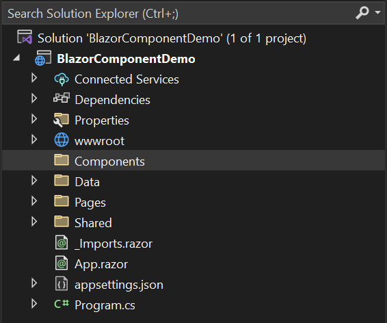
I like to create a specific components folder to organize things better. In Visual Studio, I created a folder named components.
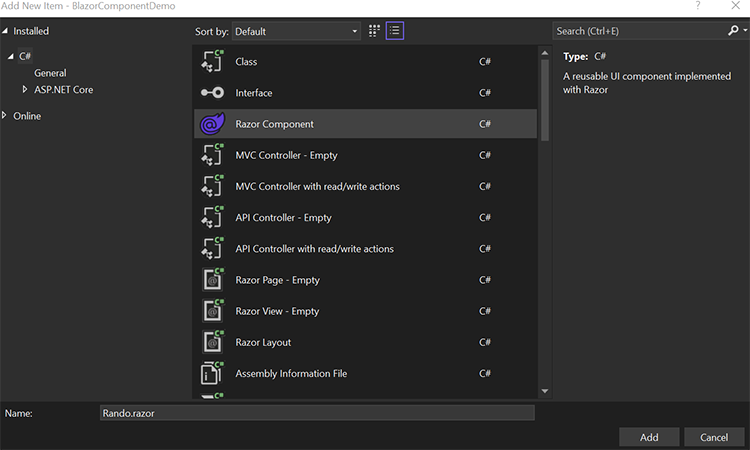
Right-click on that folder, select “add,” and then select “Razor Component”
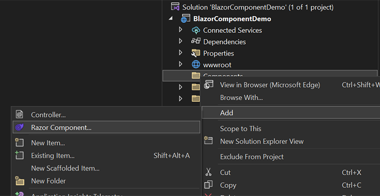
Select “Razor Component” and name it Rando.razor
Now we have a new component. Here is the code it generated:
<h3>Rando</h3>

@code {

}
Here, we have both the markup and the code in the same file. That’s fine and dandy, except I like to separate the code from markup and use a code behind approach. It’s a best practice, especially with larger projects, so you can keep the two separated and avoid one giant file.
So let’s do that.
Separating Code from Markup
Delete the @code portion of this component.
Remove:
@code {

}
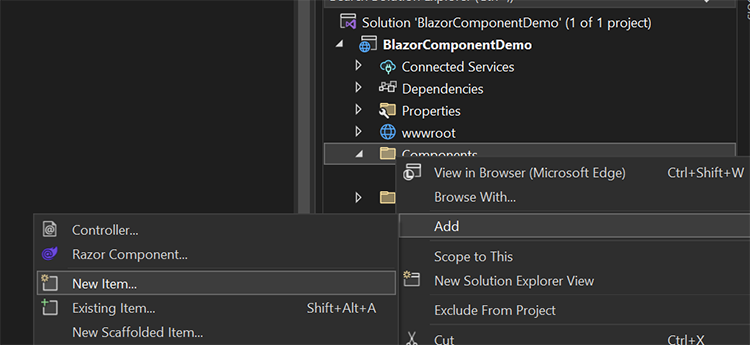
And we’ll create another file. Right-click on the Components folder again, select “add,” and then “new item.”
This will be a Class named Rando.razor.cs.
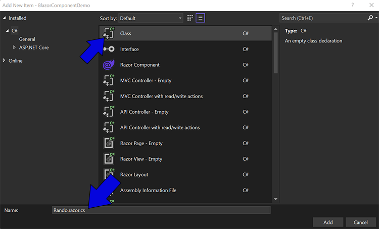
The name is essential because it must be the same as the razor component, Rando.razor, except it has .cs added. This way, Visual Studio and the compiler will know this is the class associated with our blazor component.
The code generated from this will not work right away:
This is because this is a partial class of the existing Rando class. So we’ll add in the partial keyword.
public partial class Rando
{
}
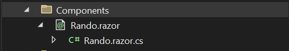
Now we have a separation of concerns, and we can design a nice component. Let’s jump back into the markup (Rando.razor) file.
Creating the Markup
For the title of our component, let’s add the following:
<h1>Random Number</h1>
And, we’ll make a value similar to the counter, a p tag with a dynamic variable representing our number.
<p role="status">Our random number: @randomNumber</p>
Next, we’ll add a button that will trigger a method call when the user clicks it.
<button class="btn btn-primary" @onclick="GenerateNumber">Click me</button>
Our @onclick event will call GenerateNumber when the user clicks the button.
Here is the complete code for our Razor page:
<h1>Random Number</h1>

<p role="status">Our random number: @randomNumber</p>

<button class="btn btn-primary" @onclick="GenerateNumber">Click me</button>
This Razor page won’t work without the code to interact with it, so let’s jump into our code behind file.
Creating the Code
Open up Rando.razor.cs and let’s add a property for our @randomNumber variable.
public int randomNumber { get; set; }
This is a common property like in any other C# class. We can get and set values to it, and it’s bound to our variable @randomNumber in our Razor code.
We need to create a method called GenerateNumber that returns a random number. Let’s create that in our code.
public void GenerateNumber()
{
  Random rd = new();
  randomNumber = rd.Next(0, 100);
}
This method will generate a random number for us between 0 and 100. The method takes no parameters and returns nothing because it updates our randomNumber variable.
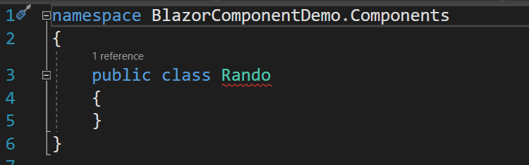
This is all the code we’ll need to implement our random number generator. Here is what the full class looks like:
namespace BlazorComponentDemo.Components
{
    public partial class Rando
    {
        public int randomNumber { get; set; }

        public void GenerateNumber()
        {
            Random rd = new();

            randomNumber = rd.Next(0, 100);
        }
    }
}
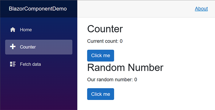
So now let’s implement it into our counter page and run it!
Implementing the Blazor Component
Implementing Blazor Components couldn’t be any easier.
Open counter.razor and add the following to the top of the file:
@using BlazorComponentDemo.Components;
This may be different depending on what you named your project.
Then, below the counter button, add the following:
<br />
<Rando />
The <Rando /> element will call our random number generator component on the page.
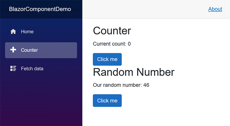
And when you click it, you’ll get a random number, dynamically generated each time you click.
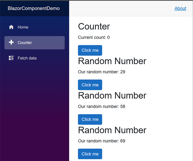
You can even duplicate the component easily, like this:
<br />
<Rando />
<Rando />
<Rando />
And each component will work independently from the others.
Congratulations! You just created a Custom Blazor Component!
Summary
In this tutorial we:
- Identified the parts of a Blazor component
- Created a new Blazor component
- Embedded the component within another component
This is just the basics of creating Blazor components. Bookmark this blog because I will go much deeper in future tutorials. Understanding and leveraging Blazor Components will help you build better software faster. They’re elegant. They’re awesome.
If you have any questions or comments, feel free to Yell at me on Twitter or Mastodon.
The Video Version of this Tutorial
If you’d rather watch a video of this tutorial, here’s one where I cover this topic.
If you’d like to learn more about Blazor, check out this great course on Blazor Fundamentals!

Skip the hype. The newsletter that keeps you in the know.
AI news curated for engineers. The AI New Hotness Newsletter is what you need.
Zero fluff. Just the research, tools, and infra updates that actually affect your production stack.
Stay up to date on AI for developers - Subscribe on LinkedIn
